For Broadstreet, transparent communication with the client through all stages of a project is a principle tenet and we see clear and effective visualization of a study’s results as a core part of that. One type of data visualization tool we are finding particularly effective for facilitating that communication are dashboards. Dashboard is a bit of a buzzword at the moment and it can mean different things to different people, but, in general, it’s a tool that helps users intuitively understand their data. It should allow them to see the big picture at a glance, but also make it easy to drill down to a more granular level. We’d like to spotlight a recent project where we used a dashboard to present the results of a discrete choice experiment (DCE) – a patient preference experiment conducted among sufferers of psoriasis – in a manner that was unique, engaging and immediate.
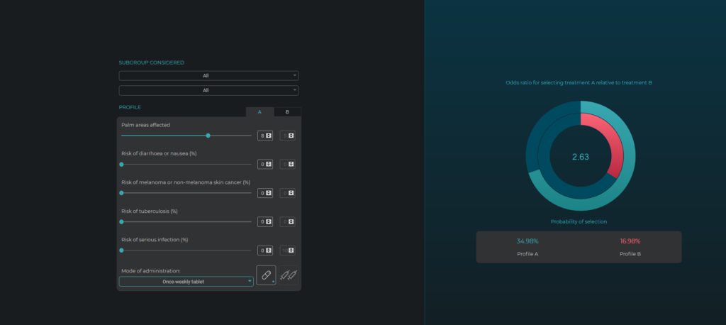
Figure 1 All patient subgroups – once weekly tablet vs. once weekly injection
The aim of this project for the client was to bring into focus different aspects of psoriasis medication and gain an understanding from patients about which aspects were most important in their choice of treatment. By means of the DCE, participants were asked to express their preferences regarding different facets of their treatment, including mode and frequency of administration, risks of various side effects, and treatment efficacy. The results of a discrete choice experiment are based on the output of regression models, and can be very quantitative and hard to parse due to the number of factors being compared. So, we decided to create a dashboard through which the research team could engage with the data, to make the results more intuitive and easy to understand, without having to dig down into regression results.
The dashboard is set up to allow you to create two distinct drug profiles to contrast treatments by attributing different values to various aspects of the therapy. It then provides an odds ratio indicating overall patient preferences between the two profiles. So, for example in figure 1, which takes into account the preferences of all patients surveyed, you can see that profile A is a once weekly tablet with a level of efficacy that leaves patients with eight palm areas affected by psoriasis, whereas profile B is a once weekly injection leaving only five palm areas affected (In these examples, the risk factors have been set as equal between the two profiles, but values can be assigned to these categories as well, giving you a more complex picture and deeper understanding of how these aspects of the therapy factor into patient preference.)
When you consider the two profiles, your initial thought would likely be that patients will prefer treatment B, that they will value efficacy above all else. But, when looking at the odds ratio graph on the right of the image you can see that patients are 2.6 times more likely to choose the tablet over the injection, despite the drug being less effective in reducing palm areas affected. For most patients, the mode of delivery is a considerable driving force in decision-making when there are injections involved. Without the data visualization dashboard, this subtlety would be more difficult to discern.
The dashboard also allows you to drill down to the results from specific patient sub-groups. And when you look at the “biologic naïve” group, who would be patients that had never previously received treatment via injection, the odds ratio increases even further (figure 2). With this group, for whom the thought of weekly injections is a daunting prospect, the mode of treatment is an even greater factor. This kind of data visualization really helps users understand that their intuitive response to a situation may not reflect the reality. That is certainly the case with these two psoriasis treatment profiles, with the mode of delivery far outweighing efficacy when it comes to patient preference.
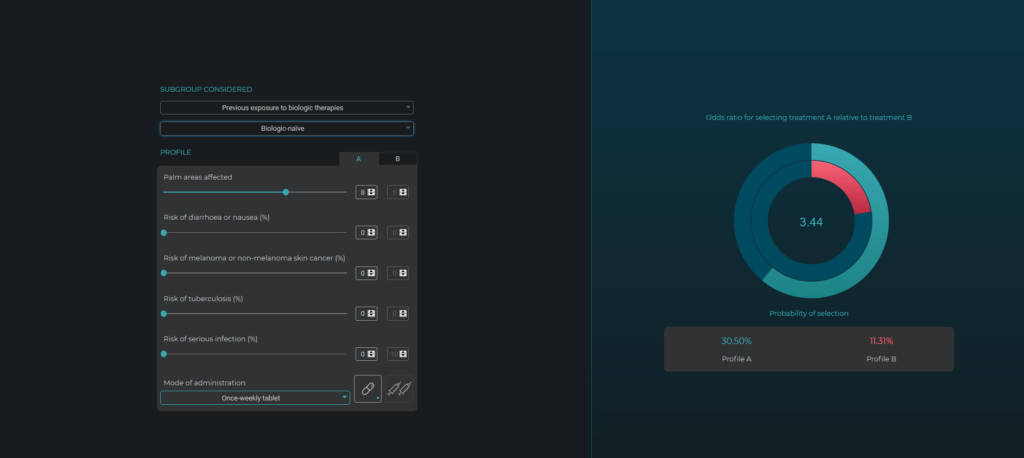
Figure 2 Biologic naive subgroup – once weekly tablet vs. once weekly injection
In this project, the dashboard made it very easy to see and understand the complex interrelationships uncovered by the DCE, which we think makes dashboards unique and exciting data visualization tools for these types of projects. Of course, disseminating results is just one aspect of their value as a communication tool. They also enhance communication with the client at the data collection stage, making it easier for the client to understand how far we are in the data collection process and providing a real-time window into how the results are shaping up.
We’d love to discuss how data visualization can bring added value to your project, and DCEs; give us a call or send us an email to arrange a chat.