The development of software tools that enable the presentation of data visually and interactively is significantly changing the way we communicate and engage with the results of HEOR and epidemiology studies. To date this change has largely focused on visualizing the output of budget impact assessments and cost-effectiveness models. While this is understandable, as data visualization tools can make the complex and multi-faceted model inputs and outputs more accessible, this is only one aspect of the benefit these tools can bring to our field. Data visualization has the potential to make the work of communicating the results of all types of HEOR and epidemiology studies more effective and dynamic.
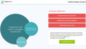
Broadstreet has been looking at how the presentation of results from other HEOR study types might be improved with these sorts of tools. One project we have just finished was the development of an app to communicate the results of a retrospective cohort study looking at treatment patterns and costs for patients identified from US claims databases who were treated with brentuximab vedotin (BV) for relapsed and refractory Hodgkin lymphoma (RRHL).
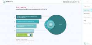
A particular challenge in this study was that RRHL is relatively rare and is more likely than other cancers to affect a younger, working-age population. Thus, to observe treatment over multiple lines of therapy requires years of follow-up per patient—not easy to achieve with US claims datasets, in which changes in employment can lead to entering or exiting the database. To address these limitations, we implemented a number of different strategies to identify the study cohort; but understanding how the study outcomes varied based on these study design assumptions remained a difficulty.
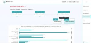
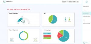
It was at that point data visualization became a real asset. We designed an intuitive web-based app that allows users to drill down into the data to better understand how those different assumptions for cohort inclusion impact the results. As well as an overview of the study and a visual breakdown of the study sample, the app provides a detailed analysis of treatment patterns and costs. The differences in cost breakdown between medication, outpatient and inpatient costs can be examined by filtering by clinical subgroups and by timeframe and the results can be displayed by mean or median.
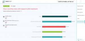
For the sensitivity analyses, the user can look at the results for the overall cohort or apply a filter to focus on just the base case or the cohort that excludes users who only received a single dose of BV. Presenting the study outcomes in this manner serves to spotlight some of the project’s key findings, but it is with the results of sensitivity analyses that the app really demonstrates its value. It allows you to quickly and effectively examine the impact of various parameters on results in a manner that is not easy within a spreadsheet or tabular results output. In this case, the visualization makes very clear the how the strategies for cohort selection substantially impact costs.
Data visualization apps are a powerful way communicate study findings because drawing people in to interact with the data helps to facilitate understanding of the what is being presented. But beyond that, the visual medium makes the information accessible to a wider audience, with the results being disseminated to and understood by, not just the research team but also those whose job it is to turn those findings into value in the marketplace.